Short Link Management
Create branded short links and track every click.
Short Link Management →Every UseClick bio page starts from a coordinated theme, not a blank color picker. Pick one of 17 presets to set your background, button style, and text contrast in a single tap, choose a Full Image or Basic layout, then customize anything underneath.
A link-in-bio page lives or dies on first impression. If the background, button color, and text contrast don't work together, visitors bounce before they read your first link. UseClick's theme system solves that by shipping 17 built-in themes, each one a tested combination of background, button fill and text color, text contrast, and button shape that you apply with a single click.
Themes are a starting point, not a cage. Once applied, every color, the button shape, the font, and the spacing between links stay fully editable from your page's Design tab. You can also run more than one bio page, each with its own theme, layout, and links, useful when a launch page needs a different look from your everyday profile.
This page covers what a theme actually changes under the hood, how the two page layouts differ, what stays customizable after you apply a preset, and how theme access works across free and paid plans.
A theme is not a single background swap, it's four coordinated properties applied at once:
The page's base background, matched to the rest of the preset.
Every link button updates to the theme's button color and matching text color, so buttons never clash with the background behind them.
Page text (your name, bio, headers) automatically renders light or dark depending on what stays readable against that theme's background, so you never end up with grey text on a grey background.
Each theme also sets a default button shape, pill, rounded, or square, matched to the rest of the preset.
Independent of theme, every bio page uses one of two layouts:
A hero photo sits at the top of the page and fades into your page background through a gradient, rather than stopping at a hard edge. Good for a cover shot, event photo, or product image you want to lead with.
The classic bio-page layout: a centered circular avatar above your name and bio, with no hero photo. Good for a portrait-style profile picture or when you'd rather keep the page uncluttered.
Layout and theme are independent settings, so you can pair Full Image with any of the 17 themes, or switch a page from Full Image to Basic without losing your theme or link setup.
Applying a theme sets sensible defaults, it doesn't lock anything down. Everything a theme touches can be overridden individually from the Design tab:
Override the theme's default pill, rounded, or square button shape for the whole page at any time.
Swap the page font for any Google Fonts family, loaded automatically, without touching the theme's colors or layout.
Adjust button text size and weight, plus compact, normal, or spacious spacing between links, to fit a short list of links or a long one.
Theme and layout access is not a paid-plan feature. All 17 themes and both layouts are available on the free plan, the same as on every paid tier.
Most link-in-bio tools hand you a background color field and a button color field and leave contrast to you. Get it wrong and you end up with pale text on a pale background, or a button that disappears into the page behind it.
Themes are one part of the broader Link in Bio page builder, which also covers content blocks, social icons, and per-link controls. Bio pages can also run on a custom domain instead of the default uclick.bio address, per page, from your Domains settings.
Setting up the look of a bio page follows the same four steps regardless of which theme you pick:
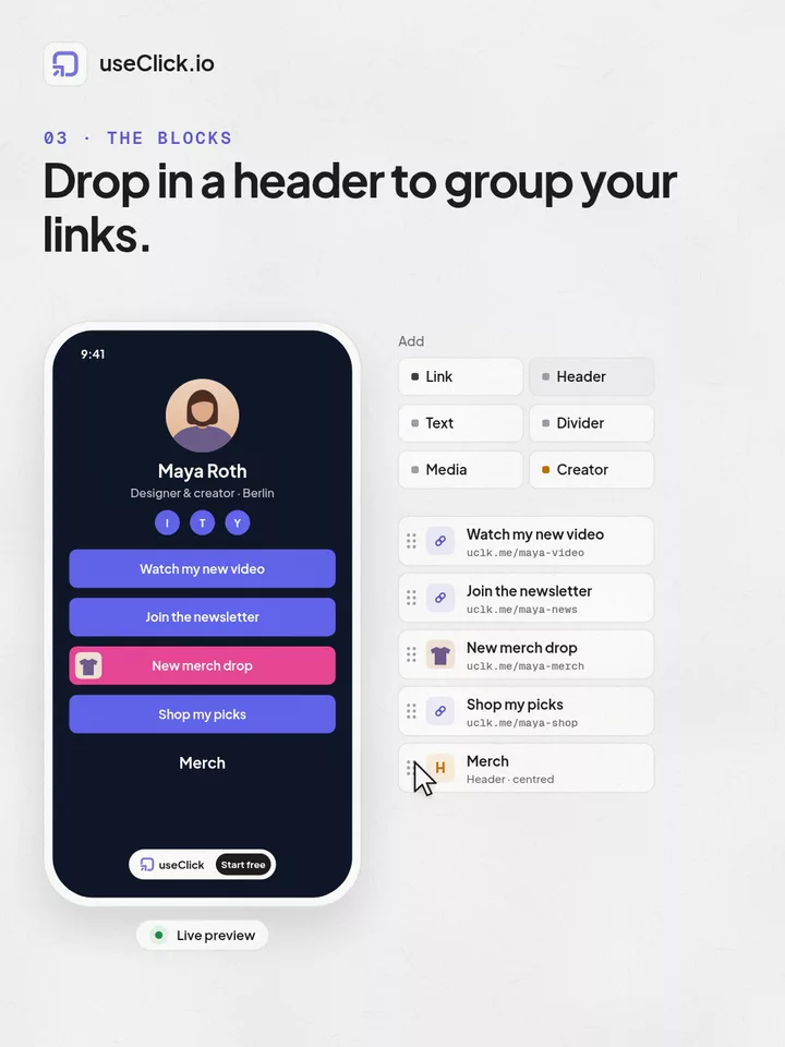
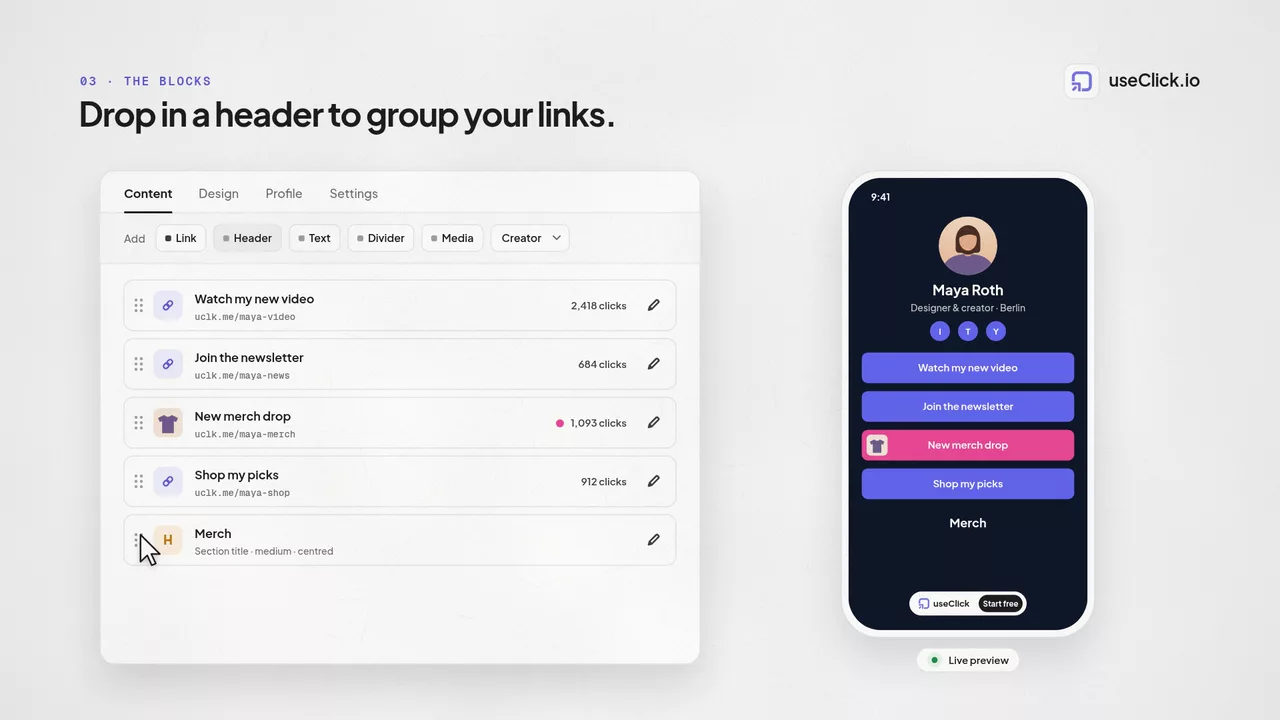
Start with Full Image or Basic. This only affects the top of the page, your links and blocks below it are unaffected.
Pick one of the 17 presets. Background, button color and text, contrast, and button shape update instantly across the whole page.
Adjust individual colors, button shape, font, or link spacing from the Design tab, or leave the preset as-is.
Check the live preview, then publish. Free pages carry the small badge, paid pages don't.
17 built-in themes. Each one is a coordinated preset, applying it sets your background, button fill and text color, whether page text renders light or dark, and the default button shape, all in one tap from the Design tab.
Four things at once: the page background, the button fill and text color, whether text renders light or dark for readability against that background, and the button shape (pill, rounded, or square). It's a coordinated set, not a single color swap.
Full Image places a hero photo at the top of the page that fades into your page background through a gradient. Basic uses a centered circular avatar instead, the classic bio-page look with no hero photo. Layout is independent of theme, so either one pairs with any of the 17 themes.
Everything a theme sets stays editable afterward. Background, button fill, button text, and optional heading and body colors can each be changed from a swatch palette or a native color picker, and you can override the button shape, font, and link spacing independently.
No. All 17 themes and both page layouts are available on the free plan, exactly the same as on every paid tier. Theme selection isn't a paywalled feature.
Free-plan bio pages show a small "useclick.io, Start Free" badge near the bottom of the page. It's removed automatically the moment your account moves to a paid plan, no separate setting to toggle.
Yes. Each bio page you run has its own theme, layout, and link setup, so an event page can use a different look from your everyday profile page without affecting either one.
A shortener, a bio tool and an analytics script each see one piece of the story. useClick connects all three, so every visit comes with where it started and where it ended.
Create branded short links and track every click.
Short Link Management →One page for all your links, with per-link analytics built in.
Link in Bio →Cookie-free traffic, regions, and top pages, no consent banner.
Website Analytics →UseClick.io makes link management effortless. Create branded short links that are clean, memorable, and built to strengthen your brand identity.