
Short Link Management
Create branded short links and track every click.
Short Link Management →Every link on your UseClick bio page can carry its own icon and its own button color, separate from whatever the rest of the page is using. Set a default once for the page, then override it link by link wherever you want something to stand out.
A UseClick bio page has one theme: one default icon mode and one default button color, applied to every link and block automatically the moment you add it. That's the fast path to a page that looks consistent without any per-link setup.
Underneath that default sits a second, more granular layer. Any individual link can override its own icon mode or its own button color from its Edit Bio Link modal, independent of every other link on the page. Nothing else on the page moves or restyles when you do.
This page covers that per-link layer specifically: the four icon modes and how overrides work, button color overrides, the separate social icon row and its searchable platform picker, and how links and content blocks share one ordered list. For the page-wide theme itself, see the link at the bottom of this page.
Every link starts on the page default. That default lives in your bio page's theme settings, one icon mode and one button color, and it applies automatically to every link and block as you add it. Turning on an override doesn't touch a global setting; it's set per link, from that link's own edit screen.
Open a link's Edit Bio Link modal and set its own icon mode or button color there. The change applies to that link only; every other link keeps following the page default.
The icon mode controls how much visual weight a link carries in the list. There are four modes to choose from, set page-wide as the default and swappable on any individual link:
The destination site's own favicon, small and neutral. Good for utility links, like documentation or terms pages, where you don't want the icon competing for attention.
A small square image pulled from the destination page. Adds a visual cue without taking over the button, a middle ground between favicon and preview card.
A full card built from the destination's Open Graph title and image, the largest and most visually prominent mode. Best reserved for the one or two links you most want visitors to notice first.
No image at all, just the link label. Loads fastest and keeps a long list of links visually calm and dense.
Set the mode once as the page default, then override individual links that need to stand out or blend in differently from the rest.
Button color follows the same two-layer pattern as the icon. The page theme sets one button color for every link; a per-link override breaks a single button out of that color without touching the theme or any other link.
A common case: every link on a page runs on the theme's default color except one, a limited-time offer or the highest-priority link, which gets its own color so it visually separates from the rest of the list without a page-wide redesign.
Social links live in a row of their own, separate from the main link list, built from a searchable platform picker instead of manual icon and color entry.
The social icon row is its own element on the page, not part of the main link list. Adding, removing, or reordering social icons never touches the order of your links or content blocks.
Each platform keeps its own brand icon and brand color inside the button, an Instagram icon still reads as Instagram. The circular button housing it is styled with your page's button color, so the row stays visually tied to the rest of the page instead of turning into a strip of unrelated brand colors.
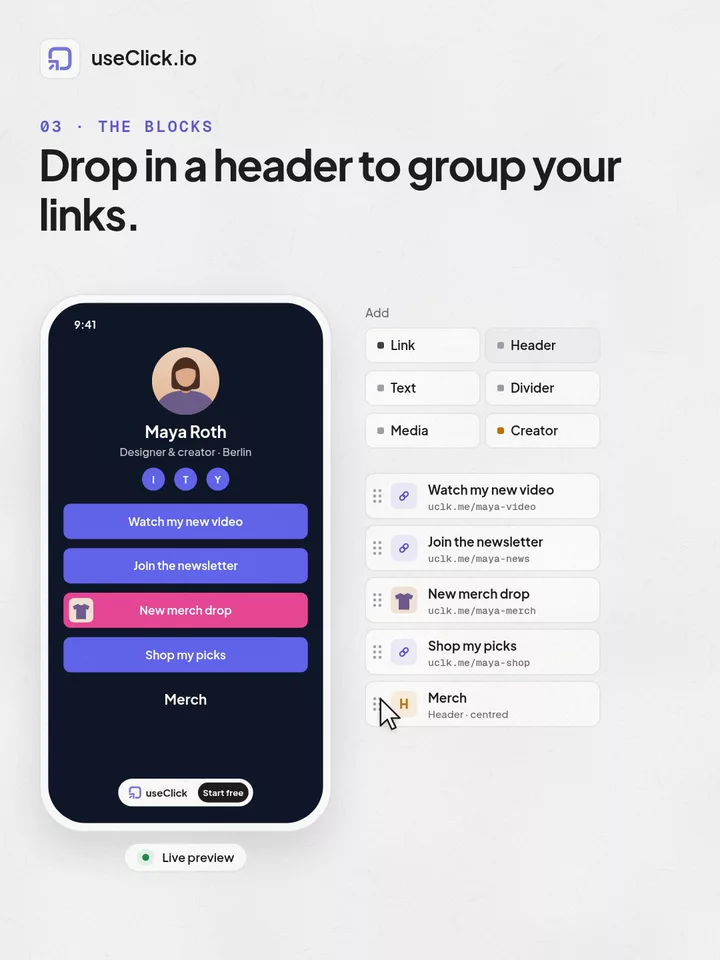
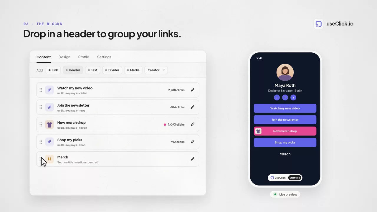
Links and content blocks share one ordered list, moved by drag and drop or the up and down arrow buttons. The social icon row sits outside that list entirely: reordering your links and blocks never moves your social icons, and reordering your social icons never moves a link.
For the full mechanics of that shared list, the block types you can mix in, and both ways to reorder it, see Content Blocks.
A page runs on the Thumbnail icon mode and a single theme color as its page defaults, applied automatically to every link added. To promote one time-limited link, its owner opens that link's Edit Bio Link modal and changes just its icon mode to Preview Card and its button color to one that isn't used anywhere else on the page.
The override lives on the link itself, not on a slot in the layout, so moving links around, adding new ones, or changing the page theme later never resets it.
Most bio-page themes are all-or-nothing: change the theme and every link changes with it. Per-link overrides add a layer underneath that, so a page can stay consistent by default and still call out the one link that matters most, without a full redesign.
Every link you add inherits the page default automatically. A page with ten links styled identically takes the same setup as a page with one.
Standing out a single link, a launch, a sale, a pinned announcement, is a two-field change on that one link, not a new theme applied to the whole page.
An override is a property of the link itself. Reorder it, and the override stays exactly as set; only changing it directly, on that link, changes it again.
Per-link overrides sit on top of two other systems that shape a bio page.
For the full page-building picture, profile, layout, and how everything comes together, see Link in Bio.
The page-wide default that every link inherits, icon mode and button color included, comes from your bio page theme.
The shared ordered list, and the Header, Text, Divider, and Embed blocks you can mix into it, are covered in Content Blocks.
Four moves cover the entire pattern for styling an individual link.
Choose a page-wide icon mode and button color in your theme settings; every new link inherits both automatically.
Build the list; each link renders on the page default with no per-link setup required.
Open a link's Edit Bio Link modal to give it its own icon mode or button color.
Search the platform picker to add social icons in their own row, styled with your page's button color.
The page theme sets one default icon mode, favicon, thumbnail, preview card, or text only, plus one default button color that every link inherits automatically. Any individual link can override either setting from its own Edit Bio Link modal, independent of the rest of the page.
Favicon shows the destination site's own icon, small and neutral, good for low-key utility links. Thumbnail pulls a small image from the destination page for a bit of visual weight. Preview card builds a full card from the destination's Open Graph title and image, the most attention-grabbing option, best kept for the one or two links you most want noticed. Text only drops the image entirely for a fast, dense list.
No. An override only applies to the single link you set it on. Every other link keeps following the page-wide default until you override it too.
They're two separate, independently ordered elements. The social icon row holds platforms chosen from a searchable picker, each keeping its own brand icon and brand color inside a circular button that's styled with your page's overall button color. The main list holds your links and content blocks, styled by the page's icon mode and color defaults, with per-link overrides available on each one.
Open the platform picker and search for the platform by name. Selecting it adds it to the social row automatically, with that platform's own brand icon and brand color already built in, rendered as a circular button.
Together. Links and content blocks share one ordered list, moved with native drag-and-drop or the up and down arrow buttons; the new order saves as you go. The social icon row sits outside that list entirely, so reordering it never moves a link and reordering a link never moves it.
No. Overrides are optional per link. Leave a link on the page default and it follows the default icon mode and button color automatically; only override the ones you want to stand out.
A shortener, a bio tool and an analytics script each see one piece of the story. useClick connects all three, so every visit comes with where it started and where it ended.
Create branded short links and track every click.
Short Link Management →One page for all your links, with per-link analytics built in.
Link in Bio →Cookie-free traffic, regions, and top pages, no consent banner.
Website Analytics →UseClick.io makes link management effortless. Create branded short links that are clean, memorable, and built to strengthen your brand identity.